When I started learning designing one thing which I constantly heard was, a logo should be a static symbol or that special typographic arrangement which should be same everywhere. It might have some regular variations like vertical, horizontal, single colour etc, that's it. Nothing much changed in the field of branding for a long time, people were just designing pretty shapes and nice typography. With the booming of digital brands some of them made a small step forward. Introduction of gradients, which was very rare in printing because most of the time gradients don’t print well. But still, the logo was that rigid form which was no fun.
Even though I was not aware of the term then, for me the first dynamic logo was from Google. They played around with their logo, changed colours, included in their doodles still we couldn't mistaken it for another brand. That's the brilliance of any dynamic logo, it's flexible, fun, ever changing still it is recognizable . Dynamic logos made the design process and the result of a branding project much more interesting and clever. It's more than a logo, it can be a communication piece. It can have colours, fonts and forms to communicate different aspects of the brand.
Here are few dynamic logos which I found interesting.
Casa da Musica Designed by: Stefan Sagmeister https://sagmeister.com/work/casa-da-musica/

MIT Media Lab
Designed by: Pentagram https://www.pentagram.com/work/mit-media-lab

HiTalk Designed by: Simone Mariano, Andrea Alati

Azerbaijan
Designed by: Landor

Battersea
Designed by: Pentagram

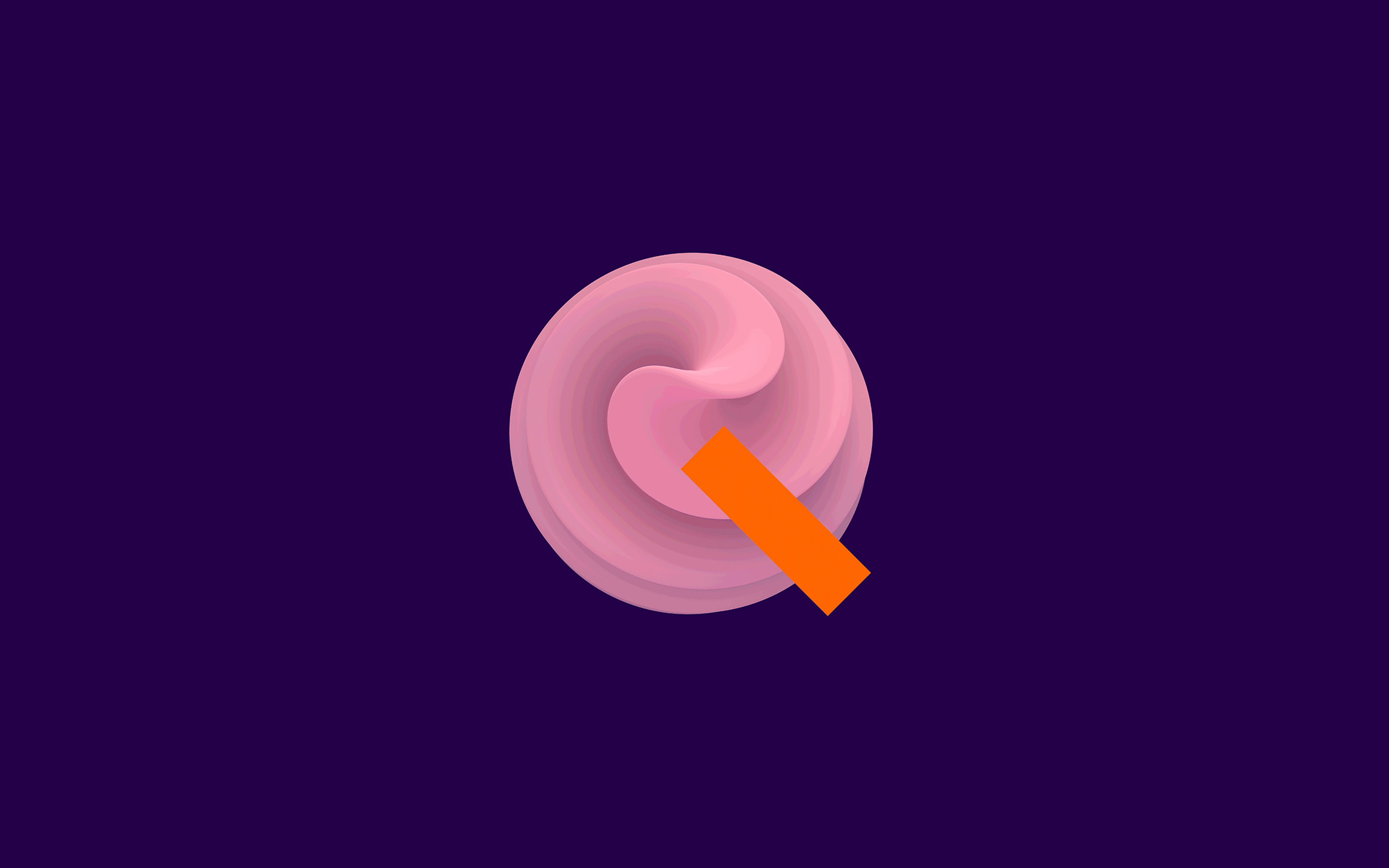
EQT Ventures
Designed by: Bold
https://www.boldscandinavia.com/work/eqt-ventures-2/